New Community Profile Dashboard
 Updated
by
PolicyMap
Updated
by
PolicyMap
The new Community Profile Dashboard has received a significant upgrade, making it more powerful and customizable than ever. Dashboards now include rich data visualizations — including charts, tables, and graphs — that make it easier to interpret and communicate complex data at a glance. Users can also tailor their dashboards by toggling individual sections on or off, ensuring each dashboard contains only the most relevant information for their audience. Perhaps most notably, dashboards now feature AI-generated summaries that summarize each section into clear, concise narratives, saving time and helping users quickly understand what the data means for their area of interest.

- The sections of Population Trends, Race, Ethnicity and Foreign Born, and Age Distribution now use the annually updated American Community Survey (ACS) from the Census.
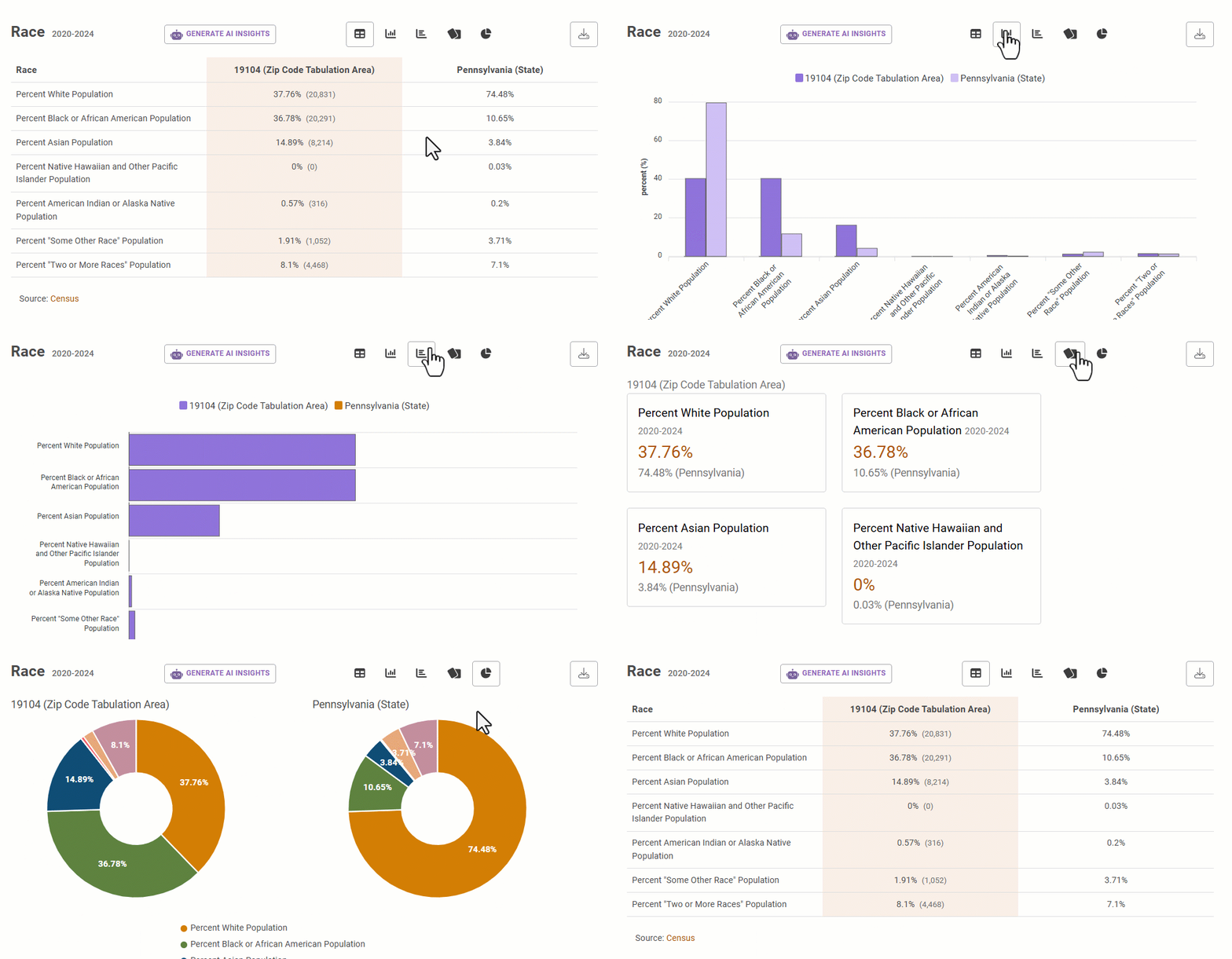
- Each section will display the values in various visualizations. Users can change the views by selecting the icons. Please note that available visualizations are based on the data.
- Table – Organizes raw data into rows and columns for comparison.
- Column – Uses vertical bars to compare values across categories.
- Bar – Like a column chart but horizontal, ideal for long category labels or rankings.
- Pie – Shows part-to-whole relationships as slices of a circle, best for a few categories.
- Line – Connects data points over time to reveal trends and patterns.
- Card - Shows data as individual cards with a comparison value of another geography.
- Map - Visualizes data on the PolicyMap map.
 to save an image of the visualization.
- The
 (Generate AI Insights) button summarizes the data for the section. AI insights are created using the OpenAI GPT-4o mini model. The model is provided with a direct extract of dashboard data and instructed to generate a concise summary with key insights. Outputs are based solely on the provided data and do not incorporate external information.
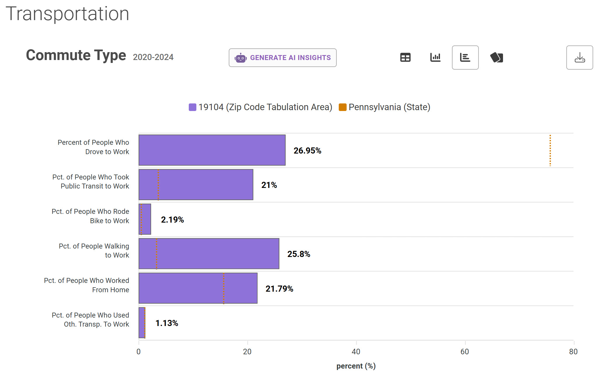
 - A Transportation section has been added which shows commute type and people who Work From Home.
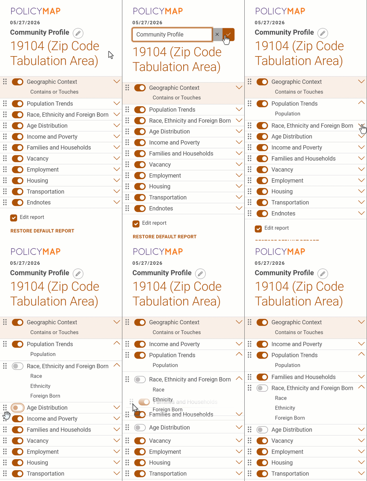
- Use the Dashboard Legend to fully customize its appearance by reorganizing sections, adding/removing sections, and even editing the saved file.
- Select the edit icon
 to change the name of the saved file.
 - Click and drag this
 icon to reorder a section.
 - Toggle the
 button to hide a section.
 - Use Restore Default Dashboard to reset all customizations.
- Select the edit icon
