Making a Dashboard
 Updated
by
PolicyMap
Updated
by
PolicyMap
Dashboards make it easy to generate data-rich summaries for any location you care about. Whether you're analyzing a neighborhood, a radius around a specific address, or a custom region you've drawn yourself, dashboards pull from the latest data available on the platform to give you a comprehensive picture of that area.
Using the Dashboard feature, users can generate a detailed dashboard for a pre-defined location, a radius around an address, or a custom region. All dashboards use the latest data available on PolicyMap.
Select the Dashboard icon to display the tool over the map.
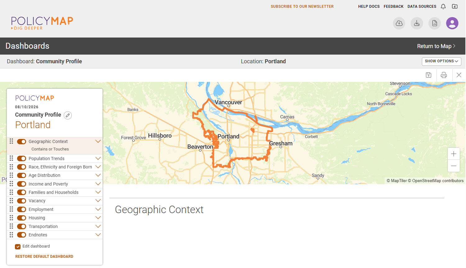
- First, choose the type of dashboard you wish to generate. Each dashboard was created with the idea that the data in a dashboard will better describe the area you selected. Here are descriptions of each dashboard:
- Community Profile is a snapshot of life in an area, including information on its population, racial composition, age, income, workforce, and much more. See a sample Community Profile Dashboard
- Community Health Dashboard provides a summary of healthcare access, health behaviors, general health, morbidity, mortality, food security, and population health in the area. See a sample Community Health Dashboard. The Community Health Dashboard is available only to premium subscribers.
- Rental Housing Dashboard includes rent information by bedroom size and income, as well as affordability data. See a sample Rental Housing Dashboard
- HMDA Dashboard is a summary of the number, typical amount, and type of home mortgage originations, including high-cost lending activity and high-interest loans by race or ethnicity. Data comes from the Home Mortgage Disclosure Act (HMDA). See a sample HMDA Dashboard
- Use the Show Options button to change the dashboard type or defined location.

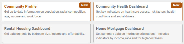
- Next, choose the area to aggregate data for the dashboard:
- Pre-defined locations are geographies in the system (i.e. cities, counties, zip codes, etc.).
- Radius allows users to enter an address or latitude/longitude and define the radius size.
- Custom Region displays any previously created custom regions in the user account.
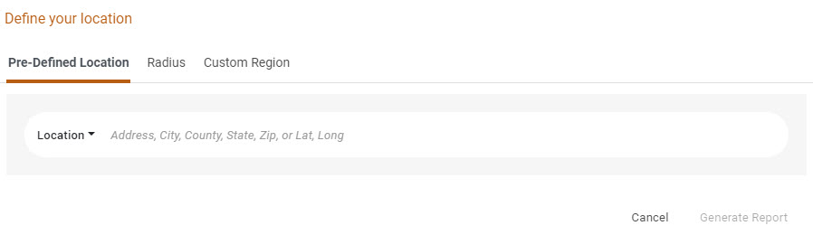
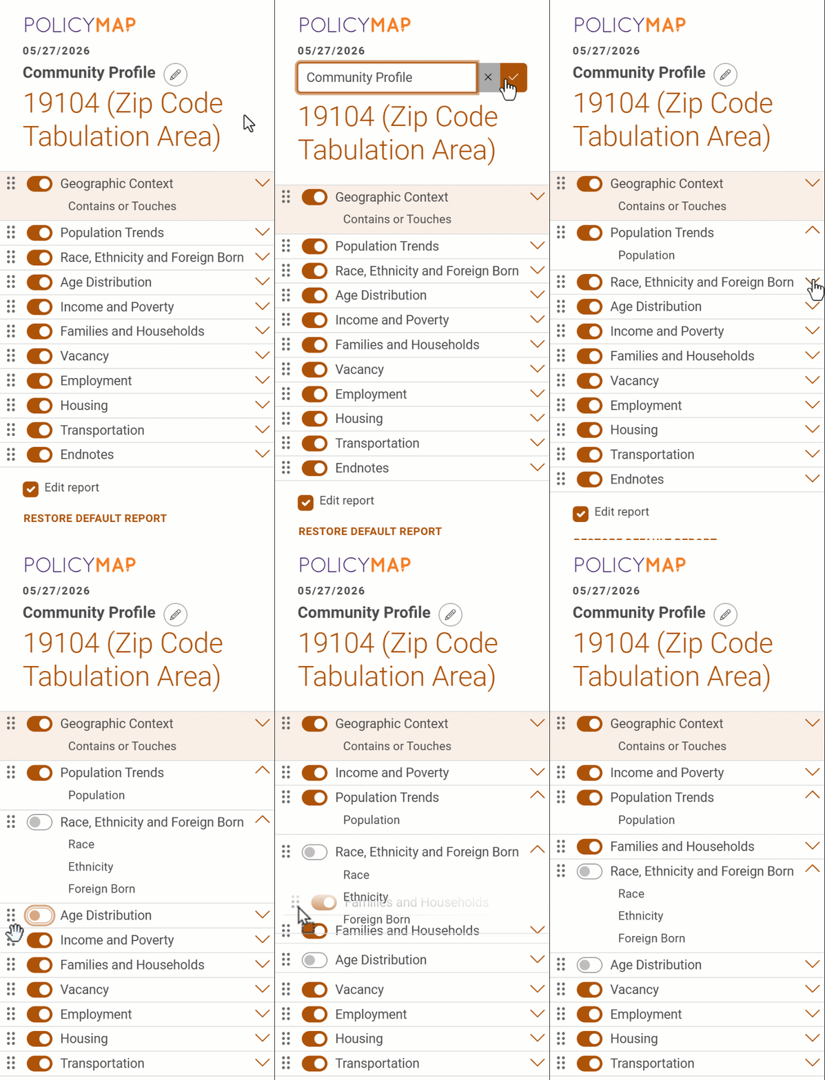
- Use the Dashboard Legend to fully customize its appearance by reorganizing sections, adding/removing sections, and even editing the saved file.
- Select the edit icon
 to change the name of the saved file.
 - Click and drag this
 icon to reorder a section.
 - Toggle the
 button to hide a section.
 - Use Restore Default Dashboard to reset all customizations.
- Select the edit icon
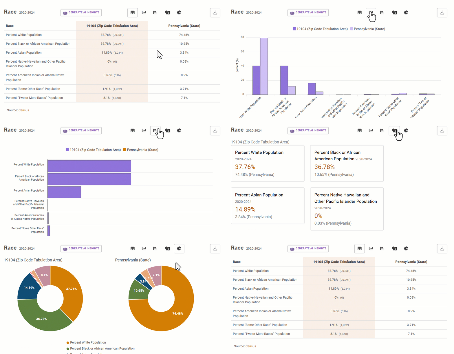
- Each section will display the values in various visualizations. Users can change the views by selecting the icons. Please note that available visualizations are based on the data.
- Table – Organizes raw data into rows and columns for comparison.
- Column – Uses vertical bars to compare values across categories.
- Bar – Like a column chart but horizontal, ideal for long category labels or rankings.
- Pie – Shows part-to-whole relationships as slices of a circle, best for a few categories.
- Line – Connects data points over time to reveal trends and patterns.
- Card - Shows data as individual cards with a comparison value of another geography.
- Map - Visualizes data on the PolicyMap map.
 to save an image of the visualization.
- Use the
 (Generate AI Insights) button to summarize the data for the section. AI insights are created using the OpenAI GPT-4o mini model. The model is provided with a direct extract of dashboard data and instructed to generate a concise summary with key insights. Outputs are based solely on the provided data and do not incorporate external information.
 - At the bottom of each section, it will show the Source and Data Aggregated by
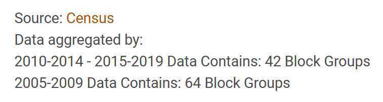
- Source is where the data comes from and will be a link that takes users to the data source entry on the Data Source page.
- Data Aggregated By shows the count of geography(ies) used to aggregate the data and the year (vintage) the geography was released by the Census. If multiple vintages are in the section, the Data Aggregated by will show the total geography across all vintages.
- Endnotes give additional details about the data and boundaries used in the dashboard. This will list all geographies and vintages used in the dashboard.
- Use the icons in the top right of the dashboard to save
 , download
  , and reset
  .
.
- Save dashboard to My Saved Work.
- Download a PDF of the dashboard.
- Reset the dashboard.
