Layers Legend
![]() Updated
by
PolicyMap
Updated
by
PolicyMap
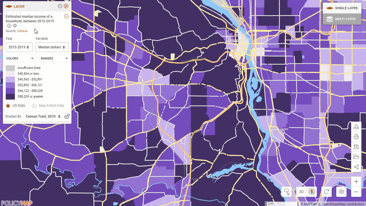
When a data layer is added, the legend will display information about the data layer including; year, variable, geography type, and the value range for each color on the map. The legend gives you the ability to customize the data on the map by changing many of these aspects.
Use the  to minimize the legend and the
  icon to remove the data layer.
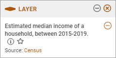 | Description and SourceData Title and Description - The title in the legend is a short sentence that describes the data. For more information, select the Source - Click on the source to see more information on the data source on our Data Dictionary page. |
 icon which will open a window with the title again and longer description of the data. Select See Data Dictionary to learn more about the data source.
Customizing Data Layer
When loading a data layer, users will see the default values and ranges for the data. We have given users a variety of options to customize a data layer.
- Year - Change the current year of the data source.
- Variable - This will change the type of data shown on the map. See the data as Numbers/Counts, Percent, Rate, or even Percent Change.
- Ranges - Create custom values for the ranges. This feature allows a user to define their own ranges for how data is shown on the map. It can be used for any numerical variable in PolicyMap. This is useful when the default ranges don't show variation in predominantly low or high values in a specific area of interest. To customize the ranges:
- Select Ranges, to open the histogram of the range
- Slide the bar for each range, or edit the value on the bottom of each bar
- Close the edit range box to exit
- Restore Defaults will revert the ranges back to default.
- Isolating Ranges - Select a color range in the legend to show on the map just those ranges.
- Map Extent - Re-calculate the ranges based on the data within the window if your map, versus a national range.
- Color - Change the map colors to suit your presentation and work.
Data Shade By
Your current zoom level determines what geography type data on the map is shaded by. For example, when looking at the nation, data is usually shaded by state. As you zoom in, the geography of the shaded data might change to the county, zip code, census tract, and finally block group level (depending on availability of geographies). Use the drop down to change the aggregation of the geography. The | 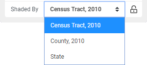 |
 icon will lock the Shade By, allowing users to zoom in and out without the data recalculating for different geographies.